
Design System
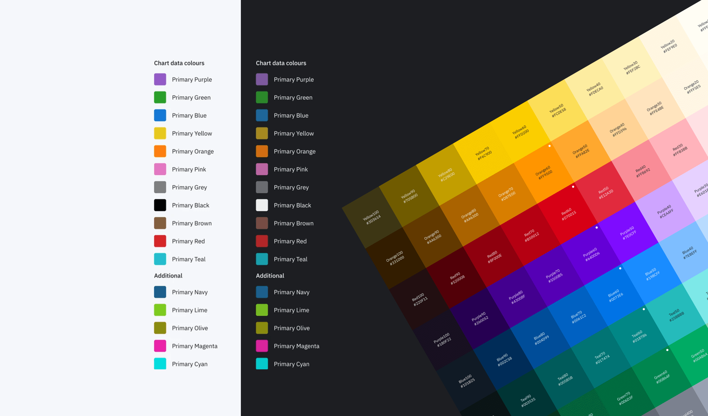
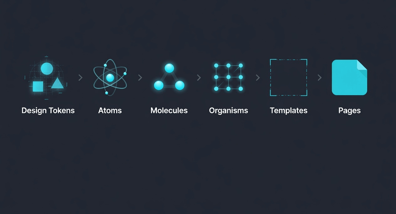
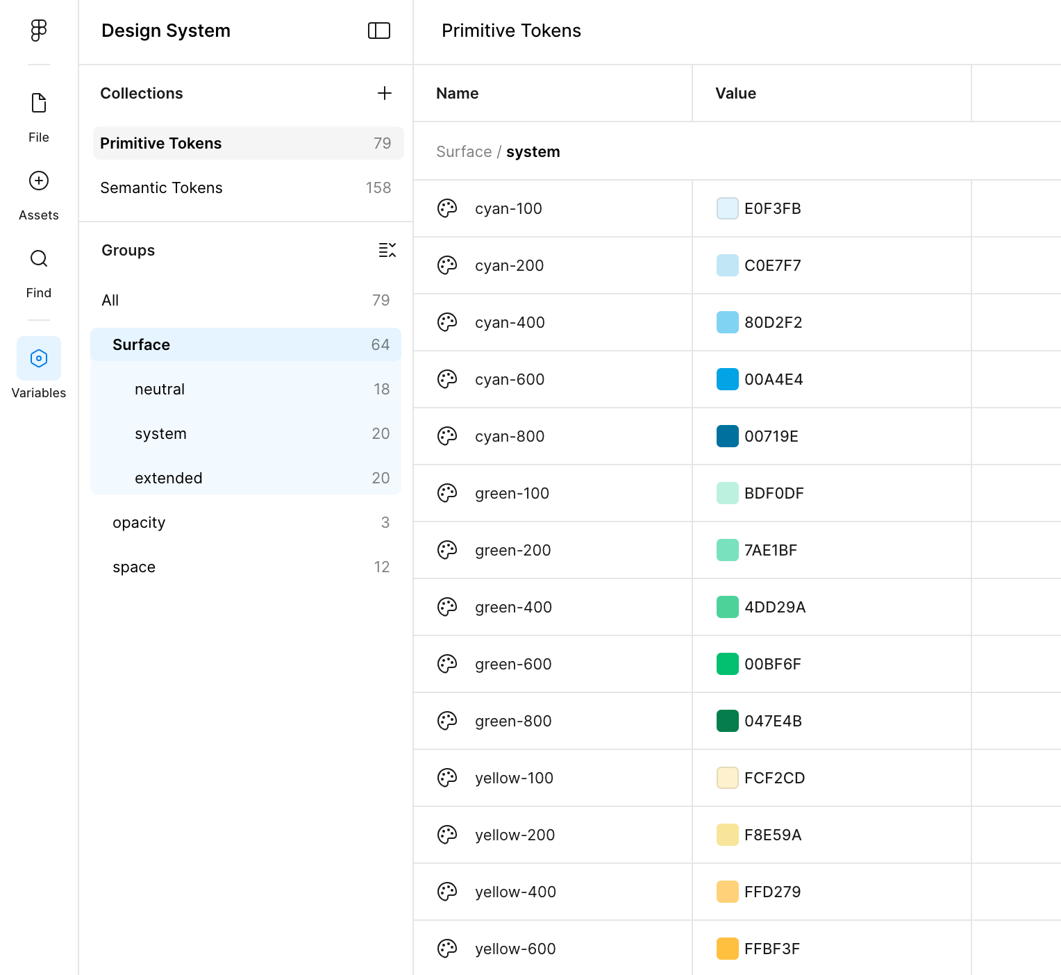
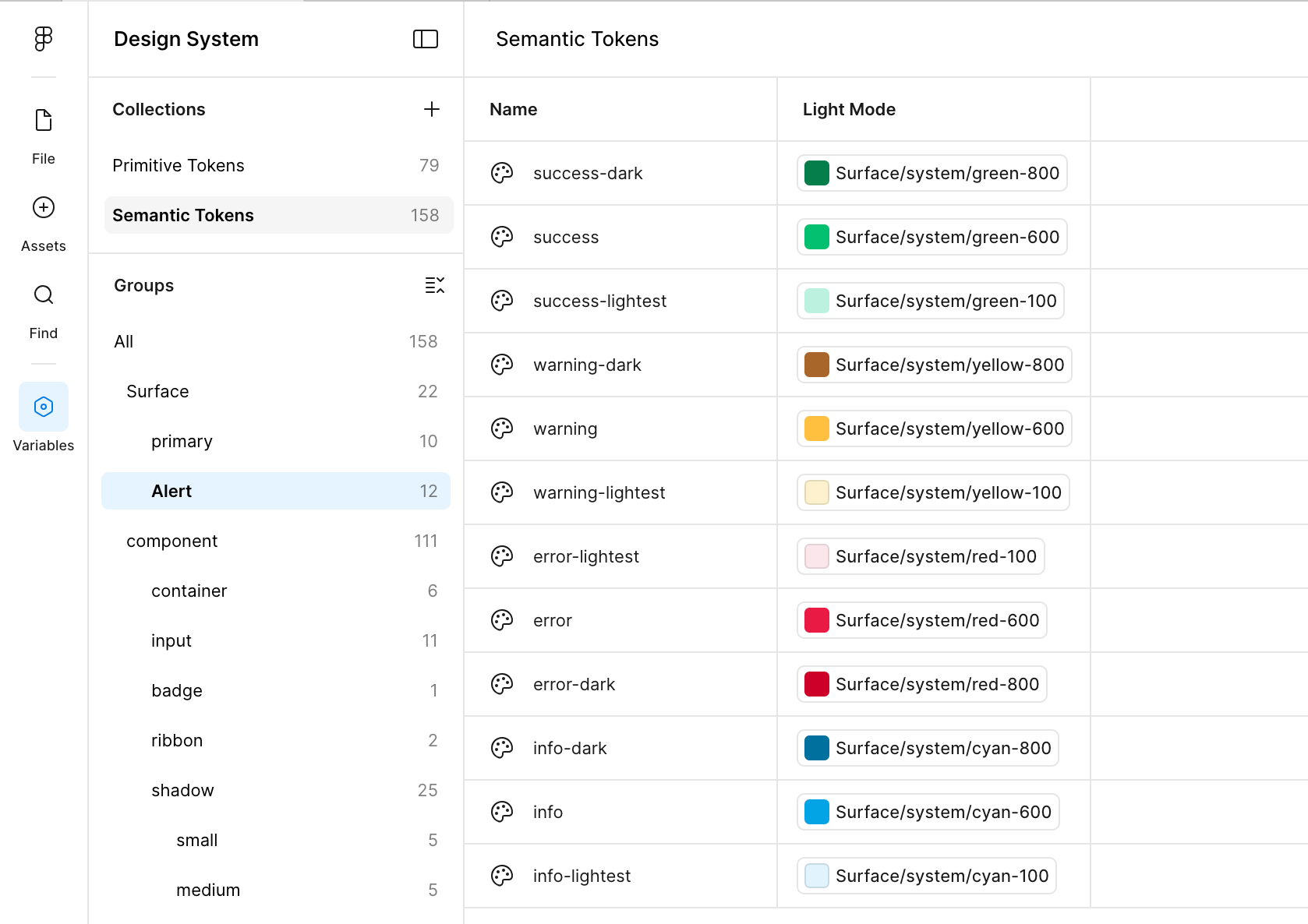
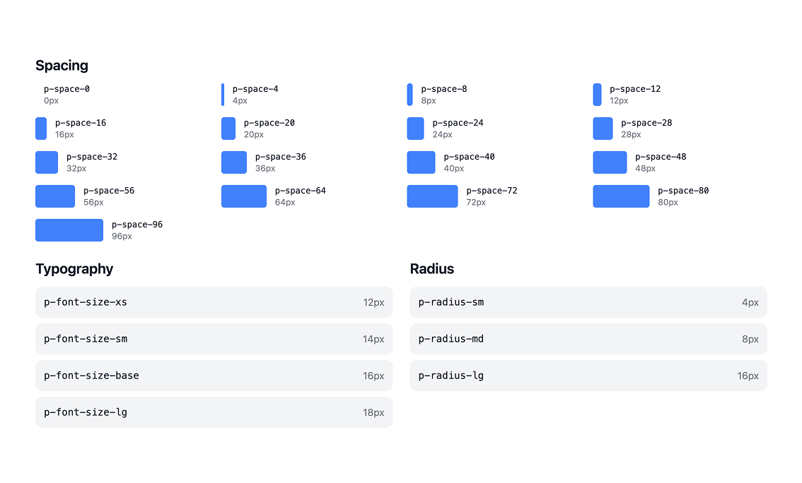
Created design system with a token-first approach inspired by Atomic Design. It starts with raw primitive tokens—full color palettes (different shades of cyan, neutrals, system colors), spacing, and border radius, all organized into flexible groups so they’re easy to reuse. One tweak to a primitive updates the whole system automatically, keeping everything consistent without the usual mess.
Project Overview
The organization faced a bloated, poorly documented, and heavily fragmented design system. Multiple shadow libraries existed across teams, designers frequently broke core components, engineers hesitated to adopt the system, and documentation was scattered or outdated. This led to duplication of effort, slower product delivery, inconsistent user experiences, and higher long-term maintenance costs — especially critical during preparation for a major global rebrand. The primary goal was to create a scalable, trusted, enterprise design system that standardized UX patterns, promoted component reuse, closed the design-to-code gap, accelerated velocity, and aligned the entire ecosystem to modern accessibility and brand standards.
My Role in the Project
As the lead design systems designer, I owned the strategic overhaul end-to-end: auditing the existing system, defining stabilization and governance strategies, redesigning core foundations (tokens, components, documentation), introducing new workflows (branching, engineering reviews), centralizing documentation, building communication channels, delivering high-impact components, and measuring adoption/impact across 45+ applications and multiple product lines.
Challenges Encountered
Multiple shadow libraries maintained by individual development teams, causing visual and functional inconsistency
Frequent unintentional component breakage by designers, eroding trust in the system
Scattered, outdated, or missing documentation leading to confusion and non-adoption
Traditional handoff model created rework, misalignment, and long design-to-code cycles
Lack of centralized visibility and communication slowed updates and increased fragmentation
Tight timelines made component creation feel cumbersome, discouraging proper system usage
User Research Approach & Insights
Conducted audits with engineering, designer interviews across product teams, usage analysis in Figma projects, reviewed component breakage logs, and ran adoption surveys before/after changes. Shadow library mapping and workflow observations revealed duplication patterns. Key insights included: 70%+ of designers admitted to forking/breaking components due to perceived process friction; Engineers cited inconsistent documentation and token mismatches as top barriers to adoption; Teams with shadow libraries spent 2–3× longer on UI consistency fixes; Centralized, credible documentation + branching workflows were repeatedly requested.
Ideation Process
Started with full audit → stabilized tokens/components → introduced branching & review flows → built centralized hub → iterated documentation structure based on feedback → delivered prioritized components (header → nav → Gantt → calendar → interactions) → measured adoption via usage analytics and surveys. Final system emphasized trust, speed, and scalability with WCAG AA baked in.
Design Foundation
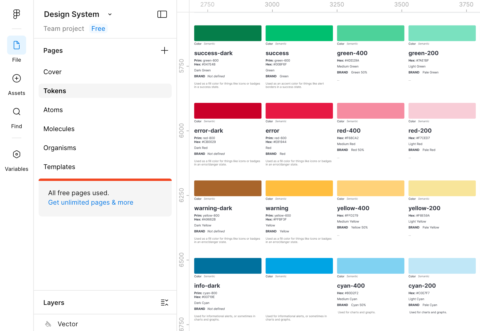
Created design system with a token-first approach inspired by Atomic Design. It starts with raw primitive tokens—full color palettes (different shades of cyan, neutrals, system colors), spacing, and border radius, all organized into flexible groups so they’re easy to reuse. Semantic tokens layer on top to give those primitives clear purpose: success links to green, error to red, warning to yellow, plus light/dark mode versions, and alert states. One tweak to a primitive updates the whole system automatically, keeping everything consistent without the usual mess.
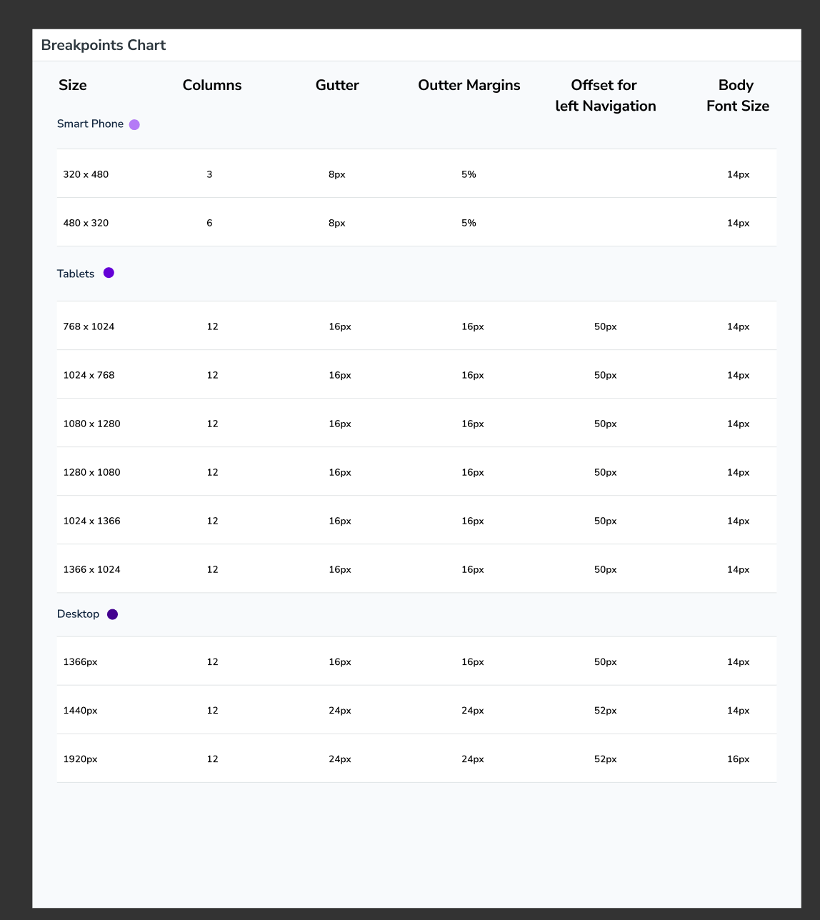
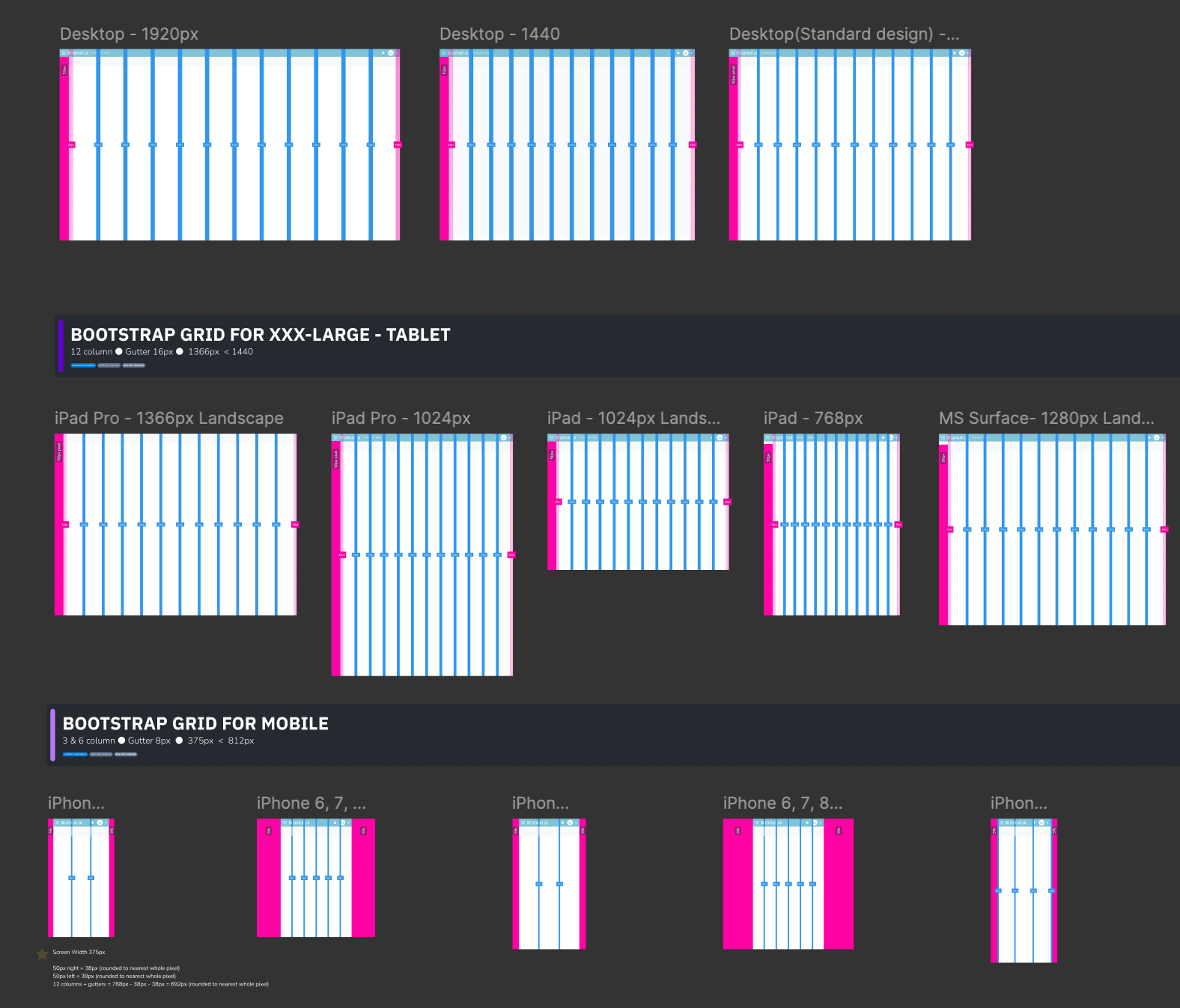
Responsive Grid System
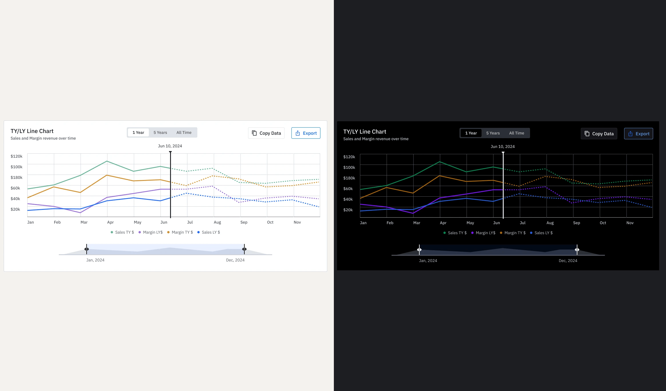
Bridges design and dev with consistent 16px gutters that expand to 50px for better breathing room on larger screens. Labeled visual guides show exact alignment, margins, and column behavior across breakpoints. Layouts stay rhythmic and structured, eliminating guesswork so Figma designs translate cleanly to code with minimal friction.
The Solution Implemented
- Stabilized token system synced between Figma and Storybook for true design-to-code alignment
- Branching workflow in Figma enabling safe experimentation without risking core assets
- Engineering co-ownership via pre-merge reviews, reducing rework, and building trust
- Single SharePoint hub consolidating all guidelines, specs, fonts, templates, and accessibility standards
- Proactive communication strategy (monthly digests, designer blog) for visibility and adoption
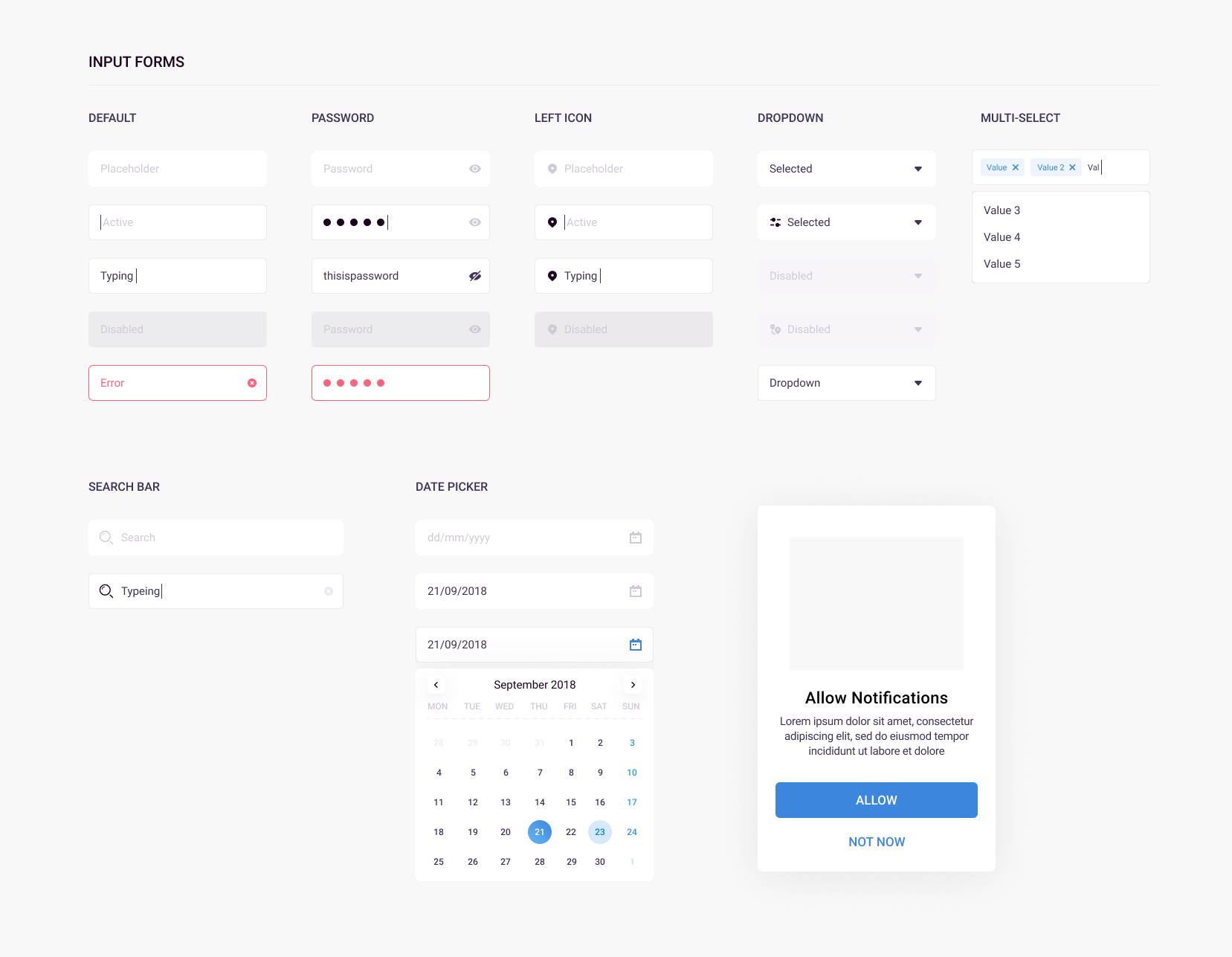
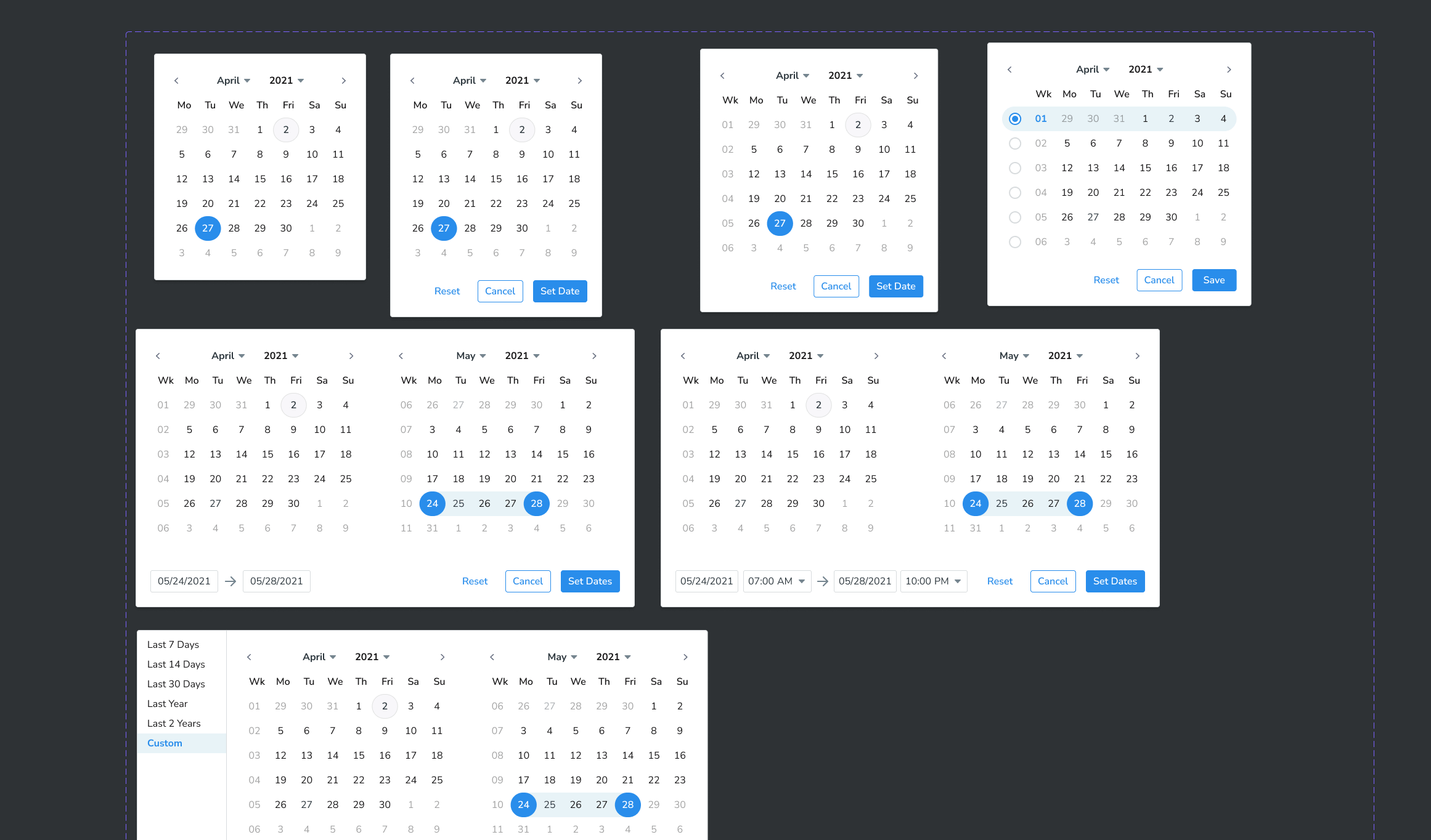
- High-impact components: global header, collapsible nav rail, Gantt chart view, calendar picker, emoji reaction library (with Lottie animations), threaded commenting, voice memo pattern, swipeable chat items
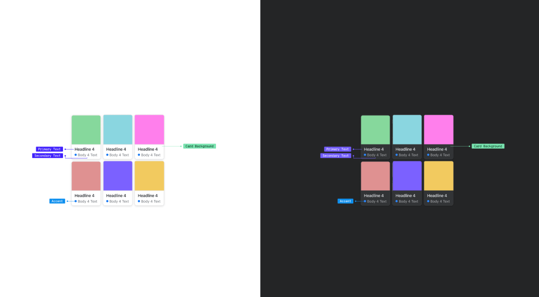
Design Evolution & Final Mockups
Step-by-step evolution showing how concepts developed into final designs.
Results & Impact
The overhaul led to a 35% reduction in broken components, a 40% decrease in redundant workflows, an 80% cleared design system backlog, a 40% boost in component velocity, and 60% faster icon production. We successfully unified over 45 applications to meet WCAG AA compliance and align with the 2025 global rebrand standards, creating a cohesive and trusted ecosystem.
35% fewer broken components followed after foundation stabilization
40% fewer redundant workflows from AI-assisted ops and co-ownership
80% reduction in design system backlog, unlocking team momentum
40% increase in component velocity for faster confident shipping
60% faster icon production unifying software/hardware experiences
45+ applications achieved WCAG AA compliance
One fully unified ecosystem aligned to 2025 global rebrand standards
Key Learnings & Reflection
Key Learnings
- Building for consistency at scale — One of the biggest takeaways was how important it is to create reusable components and patterns early. In the recruitment portal, defining a solid design system for candidate cards, status columns, modals, and action buttons saved huge amounts of time and prevented visual chaos as we added more flows like onboarding and comparison views.
- Balancing flexibility with simplicity — I learned that a good design system shouldnt feel restrictive. By creating smart defaults and modular components , we gave hiring managers and recruiters the freedom they needed while keeping the overall experience clean and consistent.
- Collaboration between design and development is everything — Working closely with developers while defining the system taught me that documentation, clear naming conventions, and early handoff sessions are just as important as the visuals. This helped us avoid last-minute rework and made future updates much smoother.
- Designing for real users, not just edge cases — I realized that a strong design system must serve both occasional users (hiring managers) and power users (recruiters). Focusing too much on complex scenarios can make the interface feel heavy, so finding the right balance between powerful features and everyday usability became one of my key lessons.
Reflection
"This project reminded me that great enterprise tools are not just about flashy interfaces — they are about reducing friction in complex, high-stakes processes. Designing the recruitment portal pushed me to think beyond individual screens and focus on building a foundation (the design system) that could grow with the product. There were moments when things felt overwhelming, especially when balancing the needs of recruiters, hiring managers, and HR admins, but seeing the team actually enjoy using the prototype made all the iteration worth it. I am proud of how the system brought clarity to a traditionally messy hiring workflow, and it strengthened my belief that thoughtful, scalable design can genuinely make peoples work lives easier."