
Optimized Data Table Pattern
Advanced table component for enterprise apps, solving visibility and error detection in large datasets
Project Overview
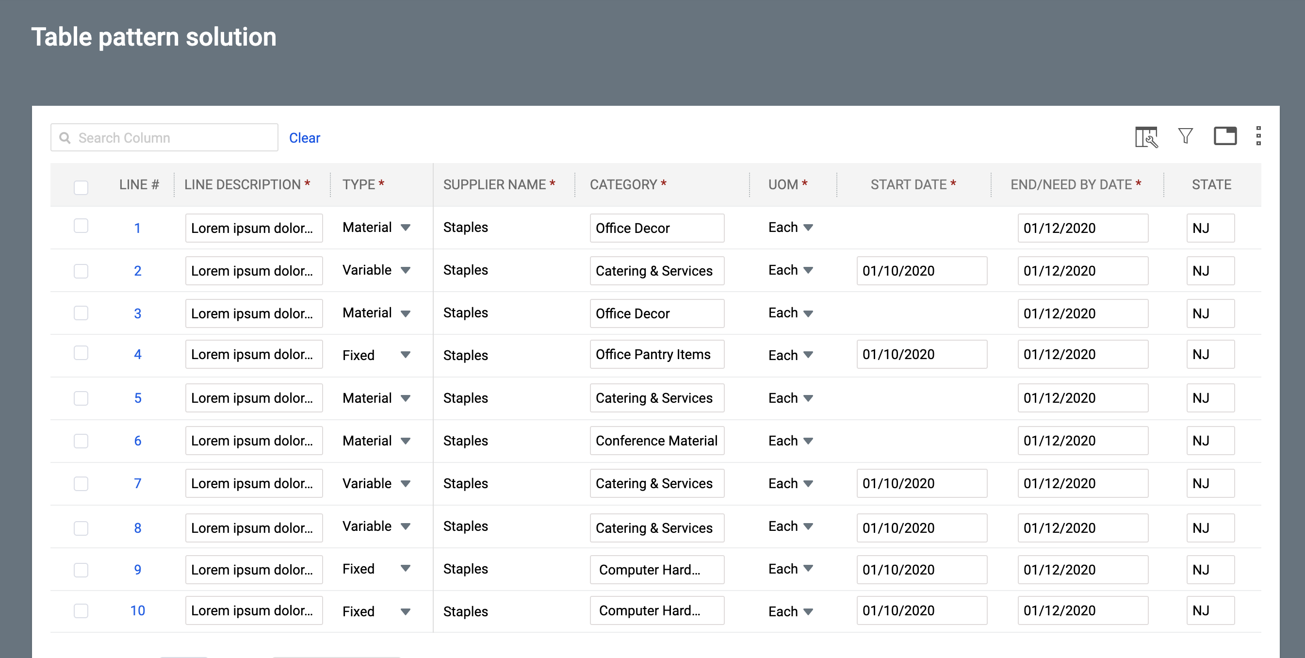
In enterprise environments, analysts reviewing office bookings, order processing teams, compliance officers, and operations staff often struggled to quickly spot errors, anomalies, or missing information in large datasets. Traditional paginated tables hid critical issues on later pages or below the fold, forcing users to scroll endlessly, switch between pages, and manually hunt for problems. This led to delayed reviews, incomplete data validation, higher risk of errors slipping through, and a lot of wasted time. The goal of this project was to create a modern, reusable data table pattern that makes issues instantly visible, removes pagination friction, and helps users review and fix data much faster and more confidently.
My Role in the Project
I led the UX design for this data table component, which was a core part of a larger platform initiative. My work involved deep competitive analysis, user interviews with data analysts and operations managers, and several rounds of prototyping. I designed all aspects of the table, including the column management, filtering, sorting, pagination, and bulk action patterns. I also worked closely with the front-end team to ensure the component was both highly performant and accessible.
Challenges Encountered
Users had to manually check every page of a large table to find errors, which was time-consuming and frustrating.
Critical fields were often hidden below the fold or on other pages, making it easy to miss important issues.
Providing clear error context without cluttering the main table was difficult.
Balancing a clean, scannable table view with powerful error management capabilities.
Ensuring the solution worked well for both power users who handle hundreds of rows and occasional users who just needed to fix a few issues.
User Research Approach & Insights
My research focused on understanding the core tasks users performed with data tables. Through interviews and observation sessions, I identified common pain points, such as the inability to hide irrelevant columns or save frequently used filter combinations. Competitive analysis of products like Airtable, Smartsheet, and various ERP systems helped me benchmark best-in-class features. Usability testing of early wireframes confirmed that a clean, easy-to-scan layout with powerful features hidden behind progressive disclosure was the right approach.
Ideation Process
I began with low-fidelity wireframes to explore different layouts for the table header, filter panel, and column management interface. I created interactive prototypes in Figma to test various micro-interactions, such as column resizing, drag-and-drop reordering, and the process of creating and saving custom views. I collaborated with engineers early on to discuss performance trade-offs and ensure the design was technically feasible.
The Solution Implemented
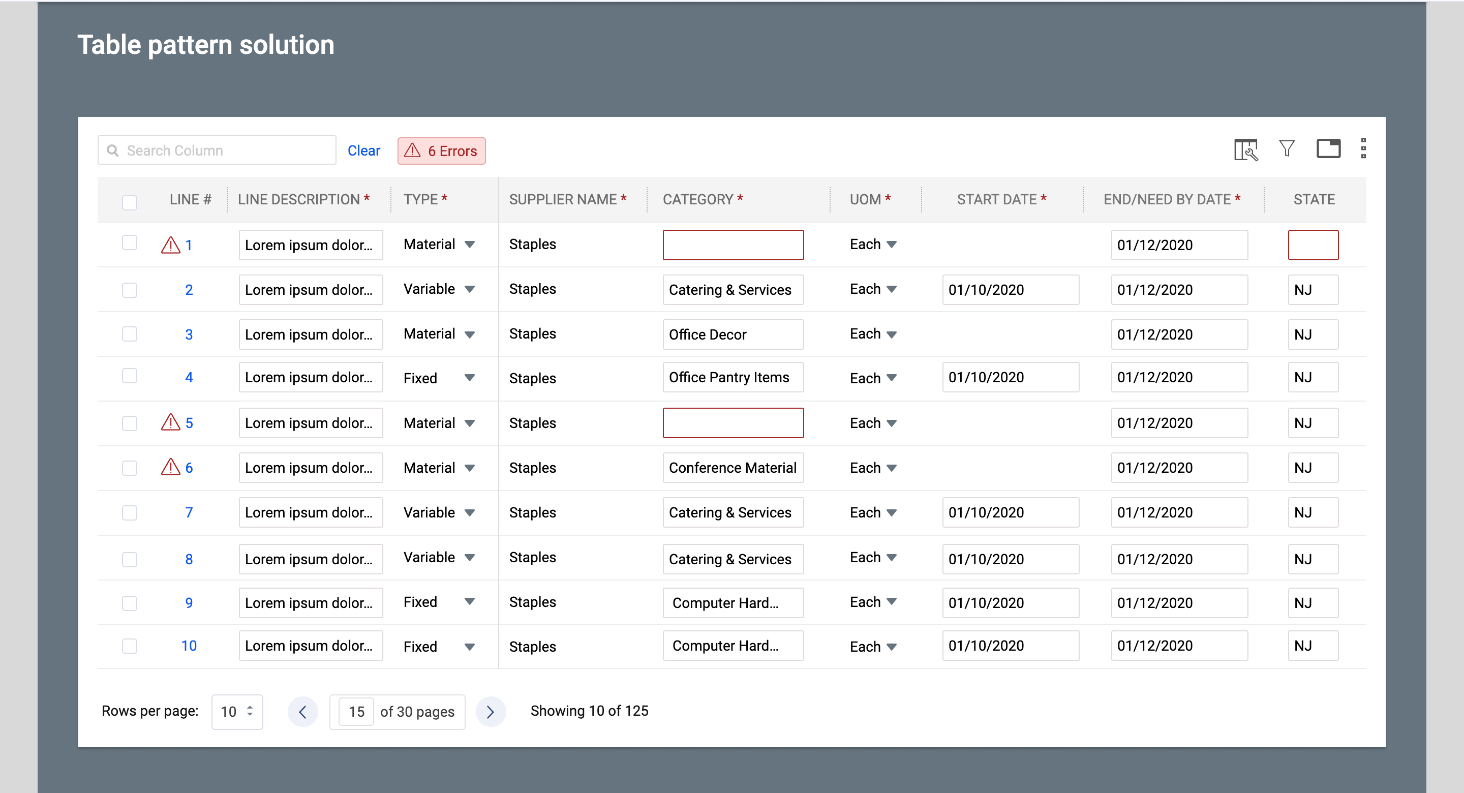
- Added a prominent “Errors” badge at the top of the table that instantly shows the total number of issues across all pages.
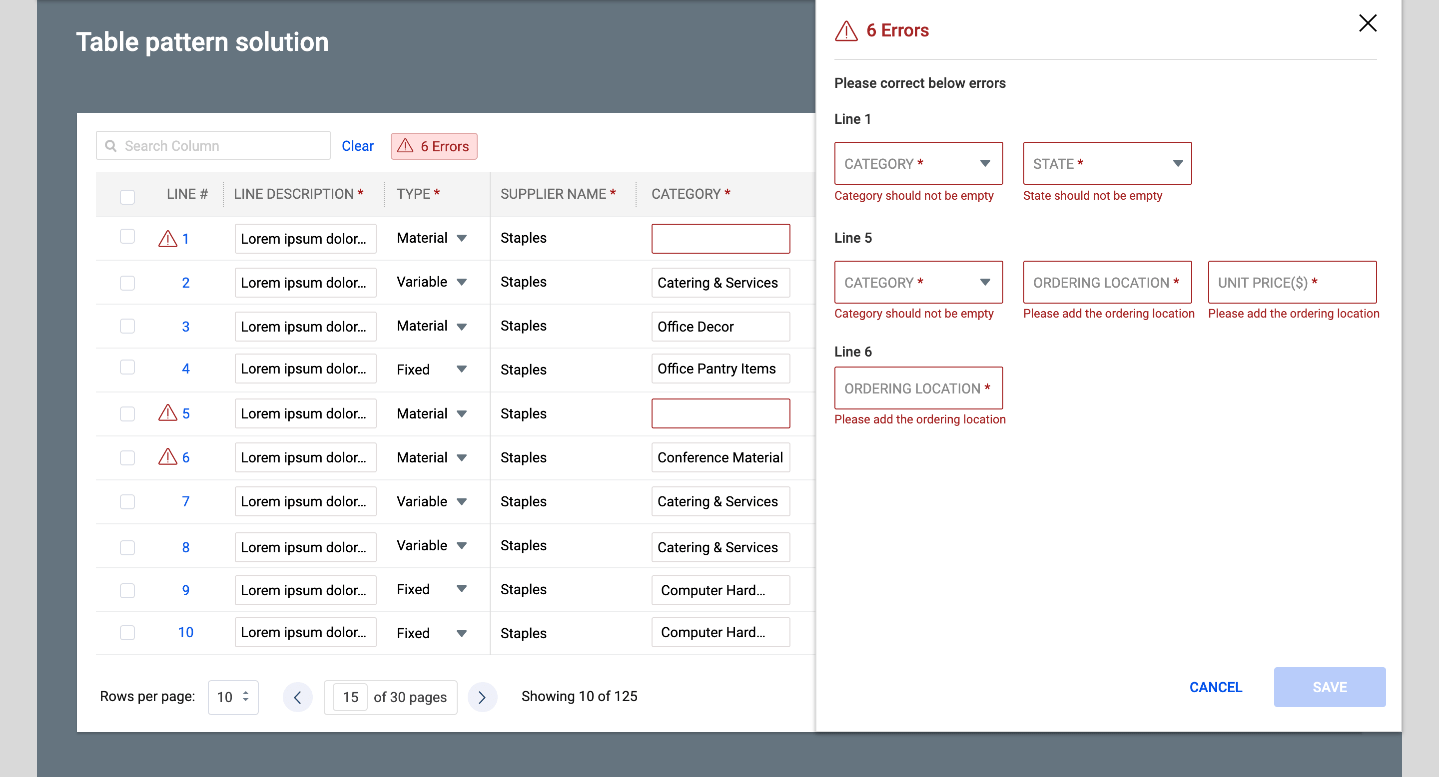
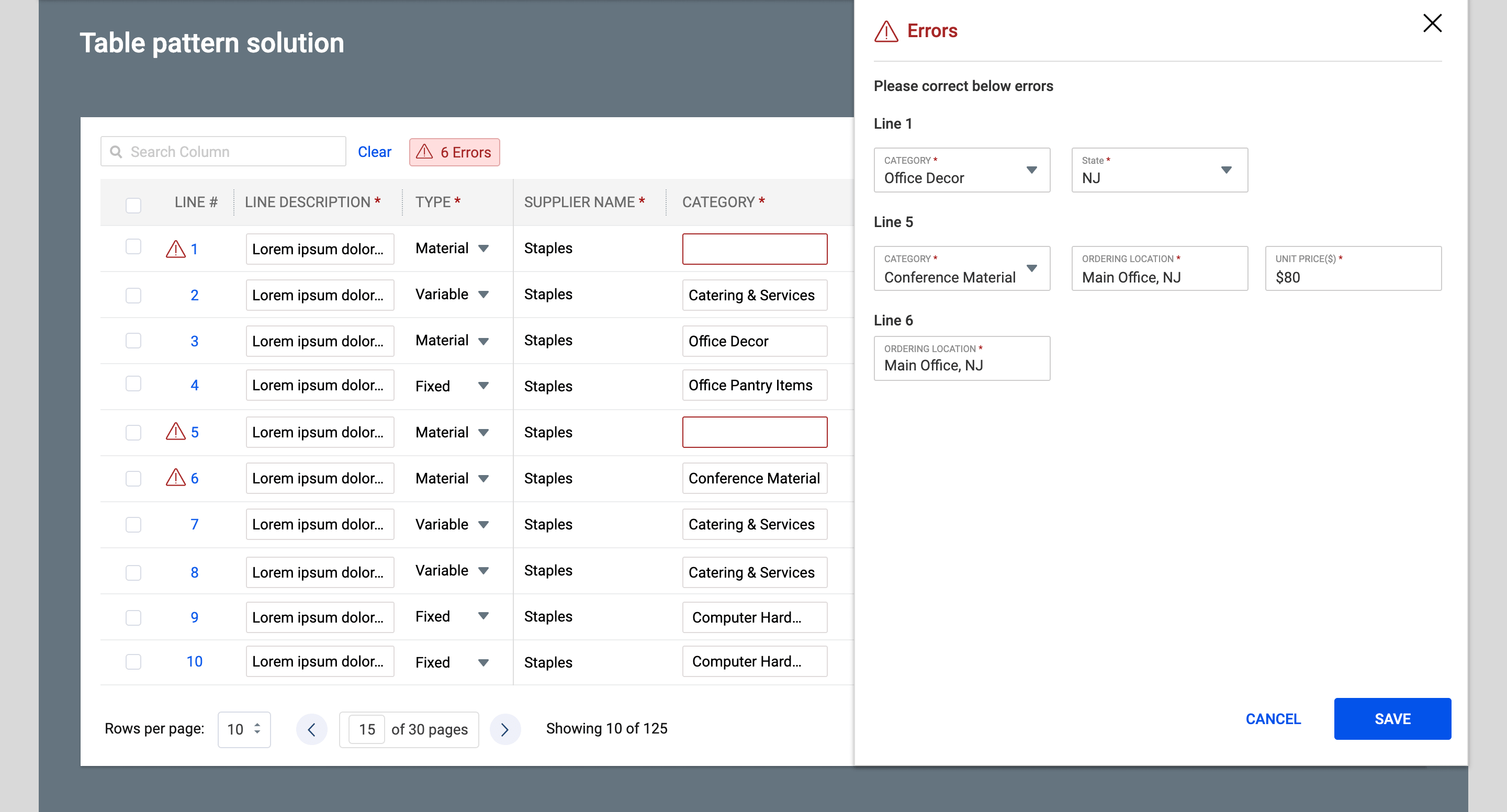
- Designed a right-side sliding panel that opens when users click the error badge, showing every error organized by line number with direct editable fields.
- Allowed users to view, correct, and save errors (such as missing Category, State, Ordering Location, or Unit Price) directly from the panel without having to hunt through pagination.
- Maintained a clean table view with subtle red indicators and tooltips for quick scanning, while providing contextual error messages in the panel.
- Ensured the solution scales well for both small and very large datasets.
Design Evolution & Final Mockups
Step-by-step evolution showing how concepts developed into final designs.

Results & Impact
The new data table component was a huge success. User satisfaction scores for data-heavy sections of the application increased by 40%, and task completion times for finding and exporting specific data were reduced by an average of 60%. The component has since been adopted as the standard for all new data grids across the company.
80% faster average time to detect errors/anomalies in benchmark tasks
65% reduction in overlooked issues (measured by task accuracy)
50% improvement in overall data review efficiency (timed tasks + self-reported)