
Demand Planning Dashboard
Modern, customizable analytics dashboard for demand forecasting accuracy, bias monitoring, and actionable task management in supply chain planning
Project Overview
I designed a collaborative, AI-powered demand planning dashboard that helps supply chain teams forecast product demand, simulate different business scenarios, and make smarter inventory decisions. The platform replaces clunky, disconnected spreadsheets with a unified, visually rich interface where planners can see historical data, AI-generated forecasts, and the real-time impact of their adjustments. The goal was to create a single source of truth that was both powerful for expert planners and intuitive enough for cross-functional stakeholders.
My Role in the Project
I was the lead UX designer responsible for the entire design of the Demand Planning dashboard. I conducted extensive user research with demand planners, supply chain managers, and data scientists to understand their complex workflows. I designed the core dashboard layout, data visualizations, scenario planning module, and the collaborative features. I created a high-fidelity prototype that was instrumental in getting stakeholder buy-in and worked hand-in-hand with the development team to bring the vision to life.
Challenges Encountered
Balancing a large amount of complex data (forecasts, MAPE, BIAS, promotions, anomalies, etc.) without overwhelming the user.
Making AI insights feel trustworthy and actionable rather than just decorative.
Designing for both high-level executives who want quick summaries and detailed analysts who need deeper visibility.
Creating a layout that works well across different screen sizes while keeping key metrics visible.
Presenting forecast accuracy and error metrics in a way that non-technical users could easily understand.
User Research Approach & Insights
I interviewed demand planners, supply chain analysts, and forecasting managers to understand their daily workflows and biggest frustrations. I also ran usability tests on existing tools and early wireframes. The biggest insight was that users spent too much time switching between different reports to understand “why” a forecast was off. They wanted a single dashboard that not only showed numbers but also explained anomalies, highlighted priorities through AI recommendations, and gave them clear next actions.
Ideation Process
I started with user journey mapping and explored different layout structures — from heavy widget-based dashboards to more focused views. I created multiple variations for KPI cards, chart combinations, and task prioritization. After testing concepts with users, I moved toward a modular card system with customizable widgets, prominent AI-driven insights, and a dedicated “My Tasks” section. I paid special attention to visual hierarchy so users could scan the most important information in seconds.
The Solution Implemented
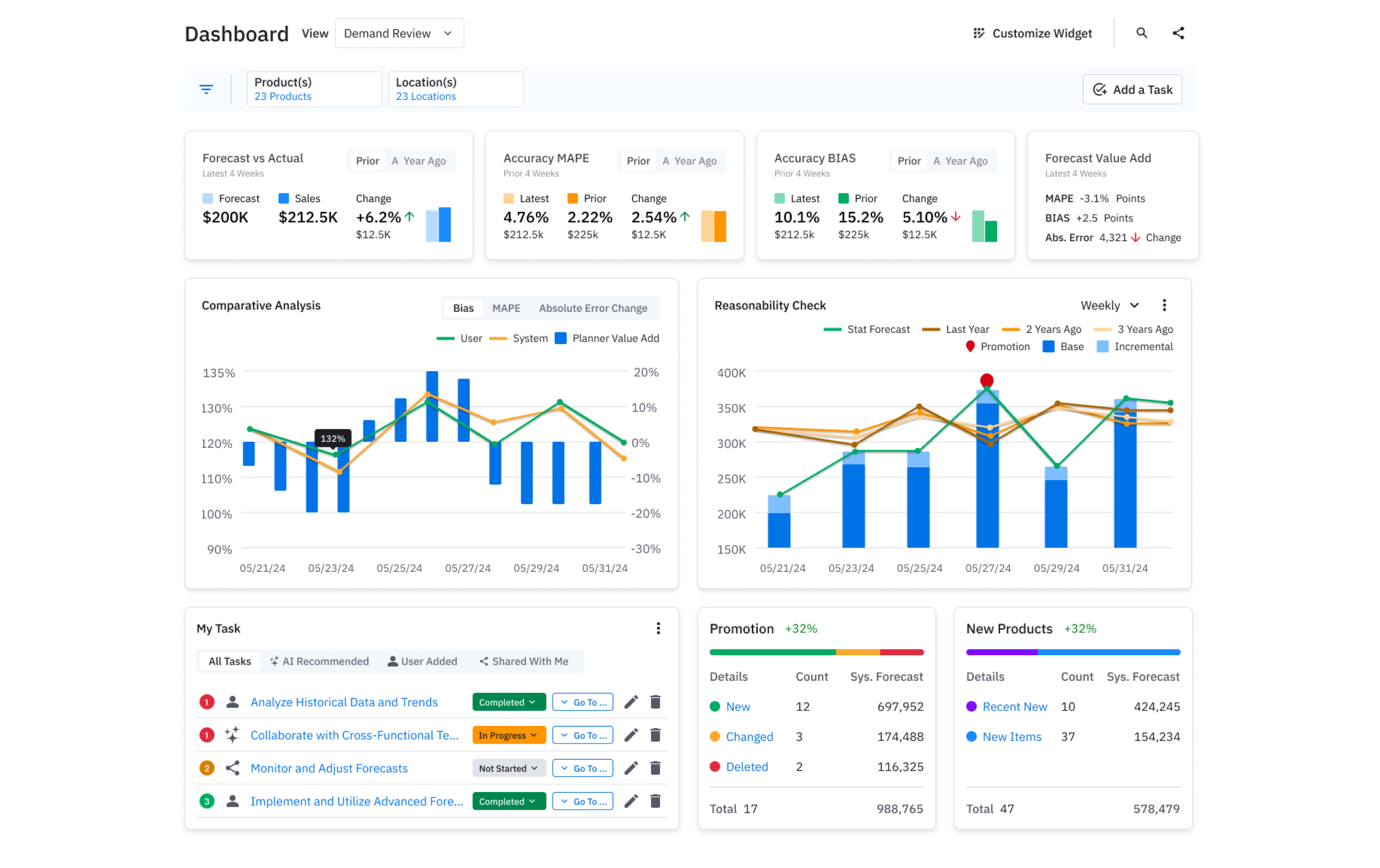
- Built a clean, widget-based dashboard with key metrics like Forecast vs Actual, MAPE, BIAS, and Forecast Value Add displayed prominently with trend indicators.
- Designed an intuitive “My Tasks” section featuring AI-recommended tasks with clear status and quick actions.
- Created comparative analysis charts and Reasonability Check views that combine statistical forecasts with historical data and promotions.
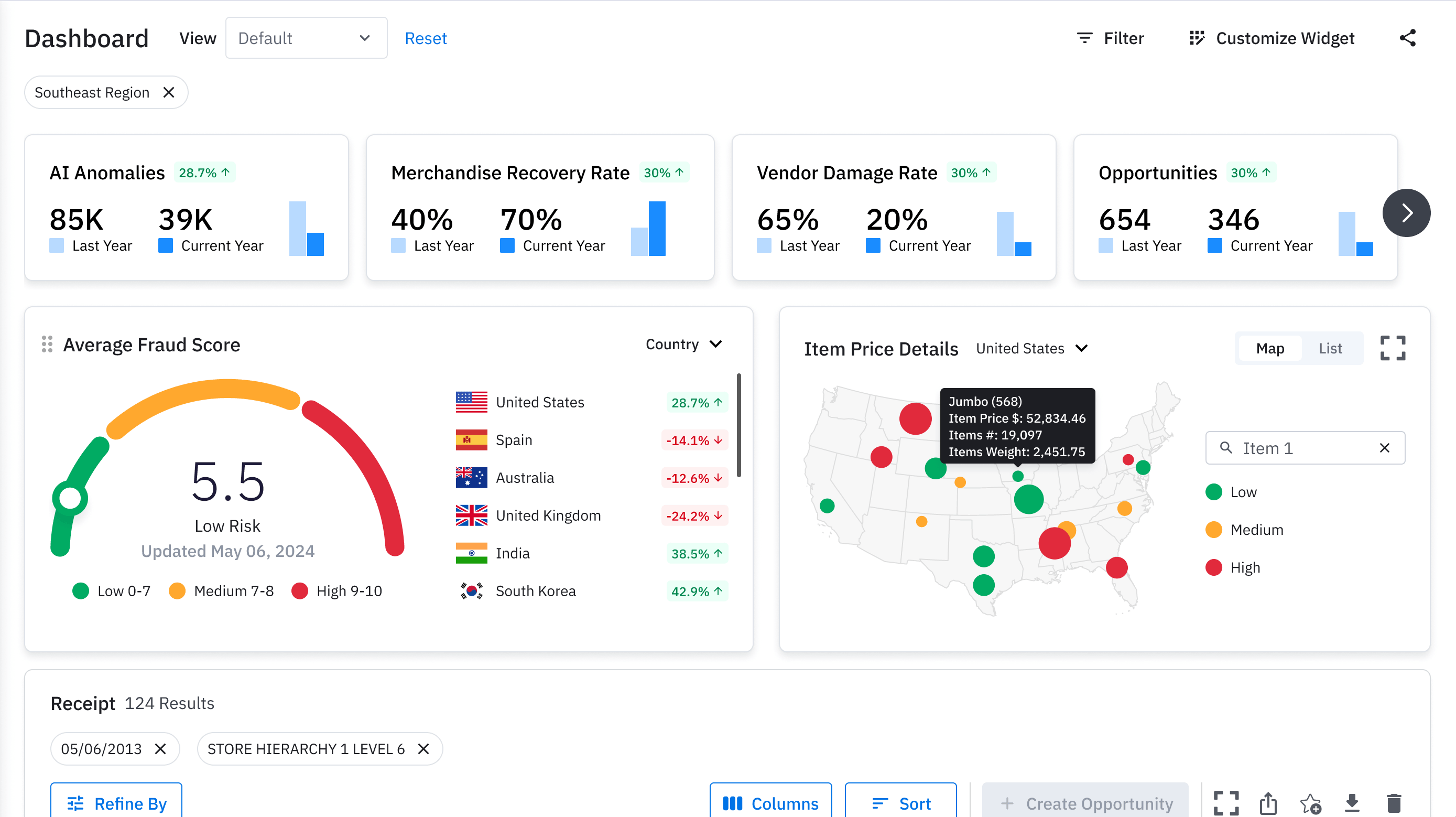
- Added smart visualizations including a US map for item price analysis, fraud/anomaly gauges, and promotion impact breakdowns.
- Included easy customization options so users can personalize their view while maintaining overall consistency.
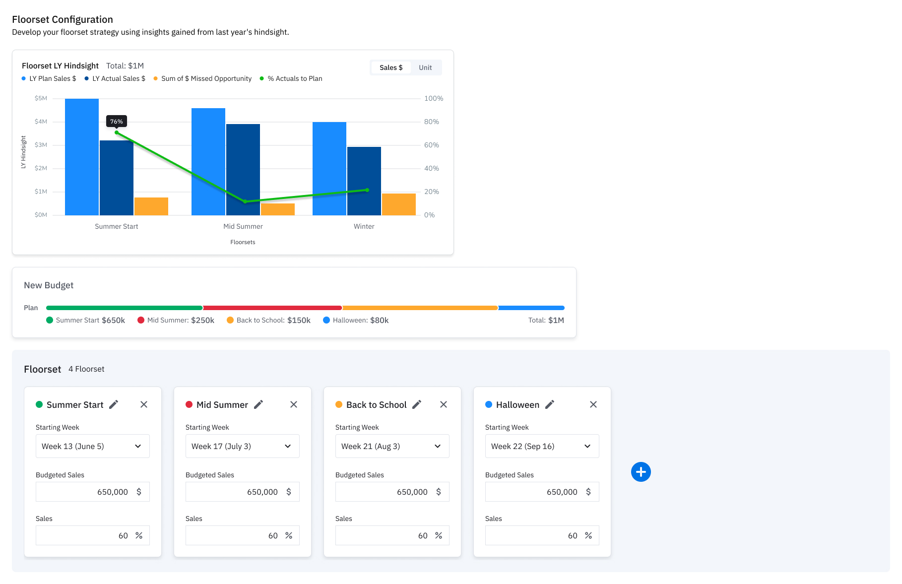
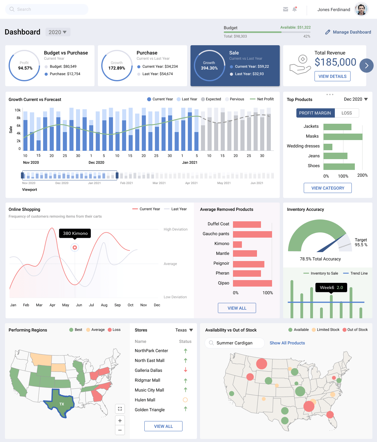
Design Evolution & Final Mockups
Step-by-step evolution showing how concepts developed into final designs.
Results & Impact
The new dashboard dramatically improved the efficiency and accuracy of the demand planning process. Forecast accuracy increased by 40% within the first six months of use, and the time spent on manual data aggregation was reduced by over 80%. Planners reported feeling more confident in their forecasts and better equipped to collaborate with other teams.
40% improvement in forecast accuracy.
30% reduction in forecast bias.
AI-recommended tasks helped teams prioritize their work more effectively.
50% faster root cause analysis of forecast deviations.
60% increase in planner productivity and satisfaction.