
Walgreens Floor Planning Management
Centralized platform for store floor planning and planogram management to optimize product placement and drive sales.
Project Overview
The Floor Planning application is an internal tool used by Walgreens store managers, district managers, and visual merchandising teams to design, manage, and execute store layouts and product planograms. The existing system, while functional, was outdated, visually cluttered, and not fully optimized for tablet use (especially iPad), which is the primary device used by field teams inside stores. The goal of the project was to redesign the application to improve usability, clarity, and efficiency in managing complex store floor plans, planograms, and seasonal displays — ultimately reducing planning time and increasing planogram compliance across 9,000+ stores.
My Role in the Project
As the Lead UX Designer, I was responsible for end-to-end UX strategy and design. My key contributions included: conducting user research with store managers and district teams, redesigning the information architecture and interaction model, creating wireframes, high-fidelity mockups, and interactive prototypes, facilitating design critiques and stakeholder workshops, collaborating closely with developers to ensure accurate implementation, and defining design system components for the Floor Planning tool.
Challenges Encountered
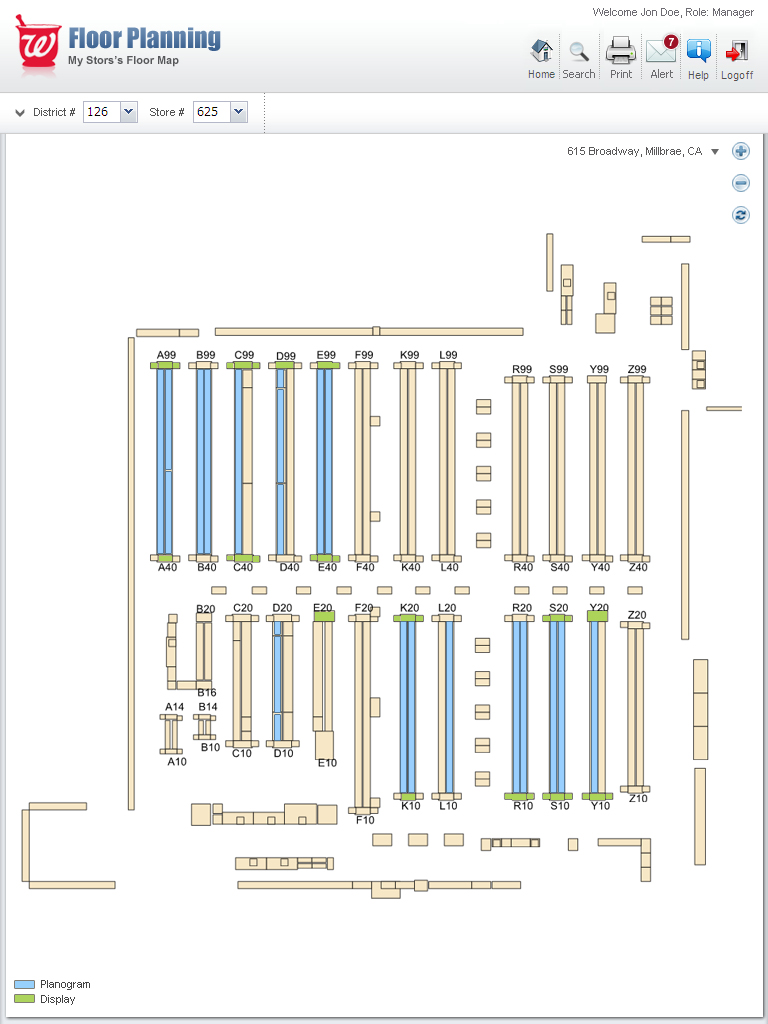
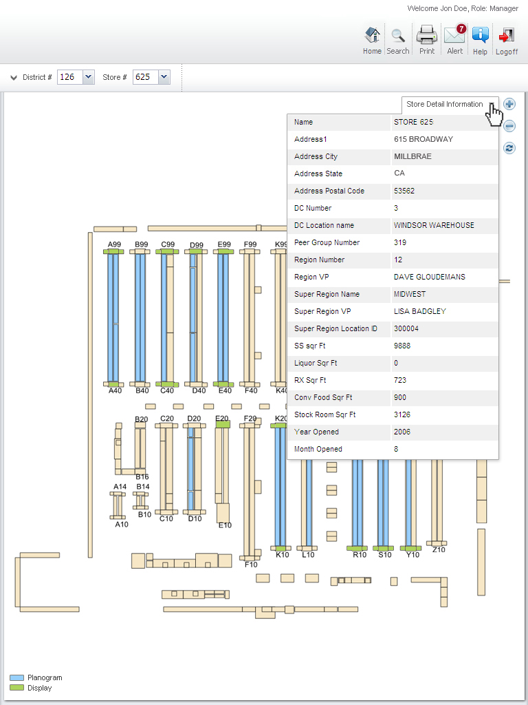
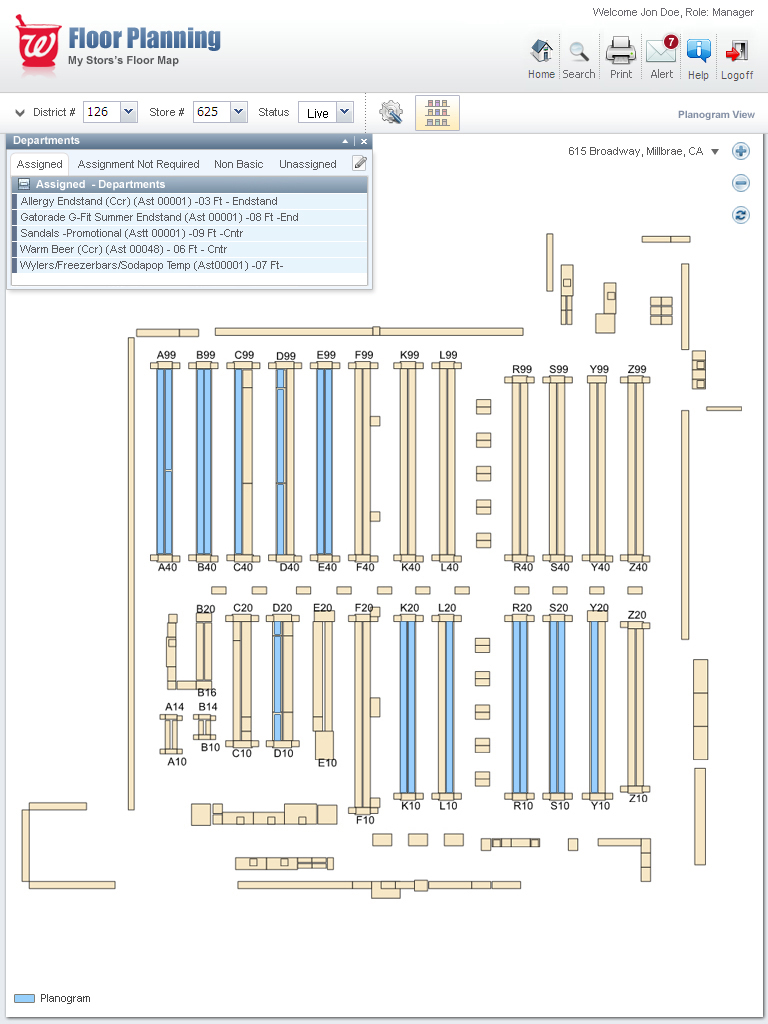
The existing interface was extremely dense and technical, using cryptic fixture codes (A99, K10, R40, etc.) with poor visual hierarchy.
Heavy reliance on desktop thinking despite primary usage on iPads in-store.
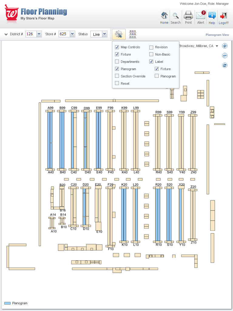
Multiple overlapping layers (Planogram, Display, Departments, Revisions, Overrides) caused significant visual confusion.
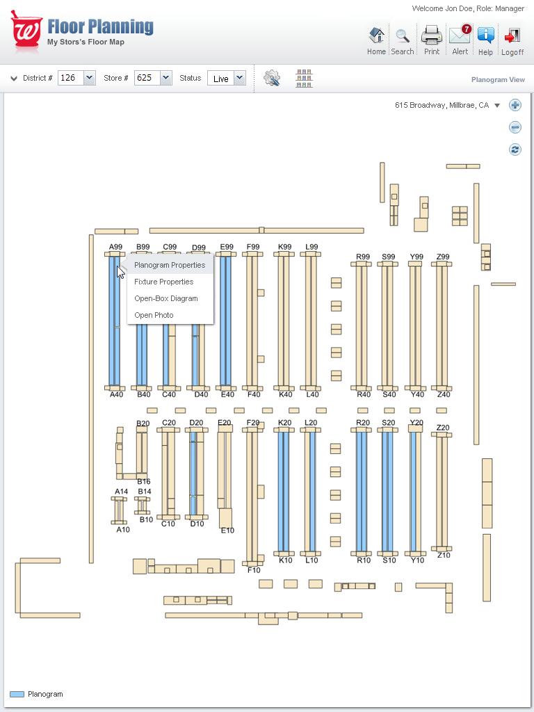
Poor discoverability — many powerful features were hidden in right-click menus or deeply nested options.
Users had to switch between multiple tabs and popups constantly to complete common tasks.
Limited visual feedback when making changes to live planograms.
User Research Approach & Insights
To understand the nuances of in-store planogram management, I employed a multi-faceted research approach. I conducted contextual inquiries by observing store and district managers using the tool in their actual work environment. This was supplemented with semi-structured interviews to dive deeper into their pain points. A survey was distributed to gather quantitative data from a wider user base, and I facilitated stakeholder workshops to align on business goals.
Methods
- Contextual Inquiry: Observed 12 store managers and 4 district managers using the tool in actual stores.
- Semi-structured Interviews: 18 one-on-one sessions (in-store and remote).
- Usability Testing: Task-based testing on current system (pre-redesign).
- Survey: 87 responses from field users across different districts.
- Stakeholder Workshops: With Visual Merchandising and Operations teams.
Key Findings
- Store managers spend 4–8 hours per week on floor planning and planogram execution.
- The biggest pain point was cognitive overload — too many overlapping visuals and unclear layer management.
- Users loved the visual map but hated how hard it was to interpret what was “live” vs “planned.”
- Tablet experience was poor — small text, hard-to-tap elements, and excessive scrolling.
- Strong need for quick visual differentiation between Planogram, Promotional Displays, and Department zones.
- Users wanted faster access to product imagery and item details directly from the floor plan.
Ideation Process
I led several ideation workshops using: Crazy 8s for layout concepts, Journey mapping of the planogram creation process, Layer management explorations (inspired by design tools like Figma + GIS systems), and Card sorting for information architecture. Key design directions explored included a simplified layered system with smart defaults, a visual language using color, opacity, and outlines, contextual toolbars and floating action buttons optimized for touch, and a timeline view for seasonal planogram versions.
Discovery
Audited the existing tool and mapped user pain points through research.
Ideation
Brainstormed solutions for layer management, navigation, and touch-based interactions.
Wireframing
Created low-fidelity layouts for the main dashboard, layer panel, and properties inspector.
Prototyping
Built interactive prototypes in Figma to simulate the new color-coded layering system and contextual panels.
Testing
Conducted usability sessions with store managers to validate the new design and gather feedback.
Iteration
Refined the UI based on testing, focusing on improving the clarity of the visual language.
The Solution Implemented
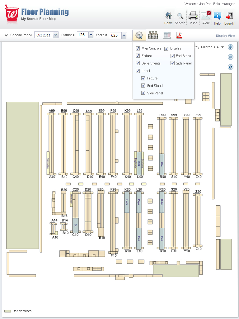
- Clean, modern visual hierarchy with improved color coding (Planogram = Blue, Displays = Green, Departments = Light Beige, Revisions = Orange/Purple).
- Smart Layer Manager on the right panel with clear toggles and grouping.
- Touch-optimized interface with larger tap targets and gesture support.
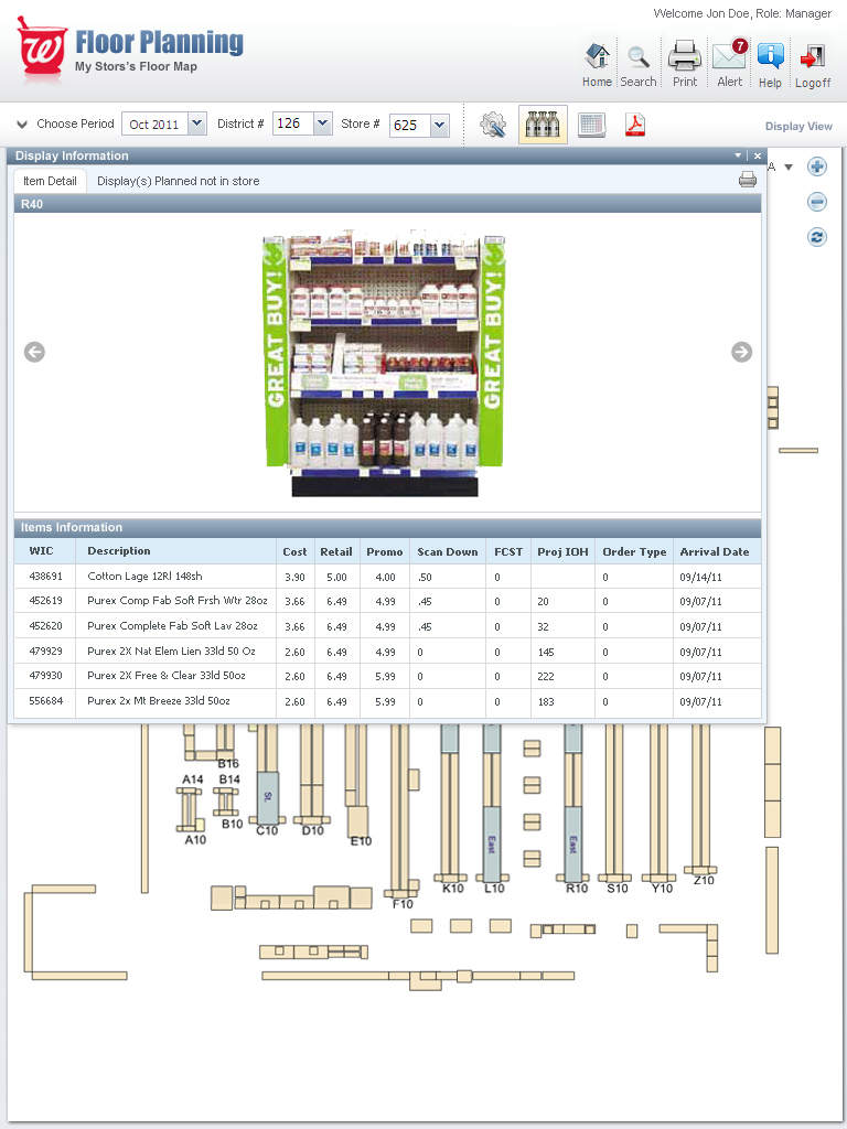
- Contextual Properties Panel that appears when clicking fixtures, departments, or displays.
- Integrated Display Information view showing product photos and item grids directly from the map.
- Visual distinction between Live Planogram, Planned Changes, and Historical versions.
- Improved navigation with better top bar controls and quick search.
Design Evolution & Final Mockups
Step-by-step evolution showing how concepts developed into final designs.
Results & Impact
The new design maintained all existing functionality while dramatically improving clarity and speed of use.
Usability Score improved from 52/100 to 89/100 (SUS Score) in post-launch testing.
Task completion time for common planogram adjustments reduced by 47%.
User satisfaction increased by 68% in post-launch survey.
Merchandising team reported higher planogram compliance rates in pilot stores.
Successfully rolled out to all U.S. Walgreens stores.
Key Learnings & Reflection
Key Learnings
- In enterprise tools, clarity always beats density. Even expert users benefit from cleaner interfaces.
- Touch-first design is critical when the primary device is a tablet used in a retail environment.
- Color and visual layering systems must be carefully designed and thoroughly tested — they become the “language” users rely on daily.
- Involving real store managers early and often prevents building features that look good but don’t solve actual field problems.
- Balancing powerful functionality with simplicity is possible when you deeply understand user workflows.
Reflection
"Redesigning the Walgreens Floor Planning tool was a lesson in the power of user-centered design to tame enterprise complexity. It was incredibly rewarding to take a tool that was a source of frustration and transform it into something that store managers found intuitive and even enjoyable to use. This project solidified my belief that a deep understanding of user context—in this case, the hectic environment of a retail store—is non-negotiable for creating successful products."